stock here: I wasn’t going to spend much time on new Stats, after all, we do know close enough what is really going on. I started my meditation with the idea to roughly forecast the world population going forward based upon:
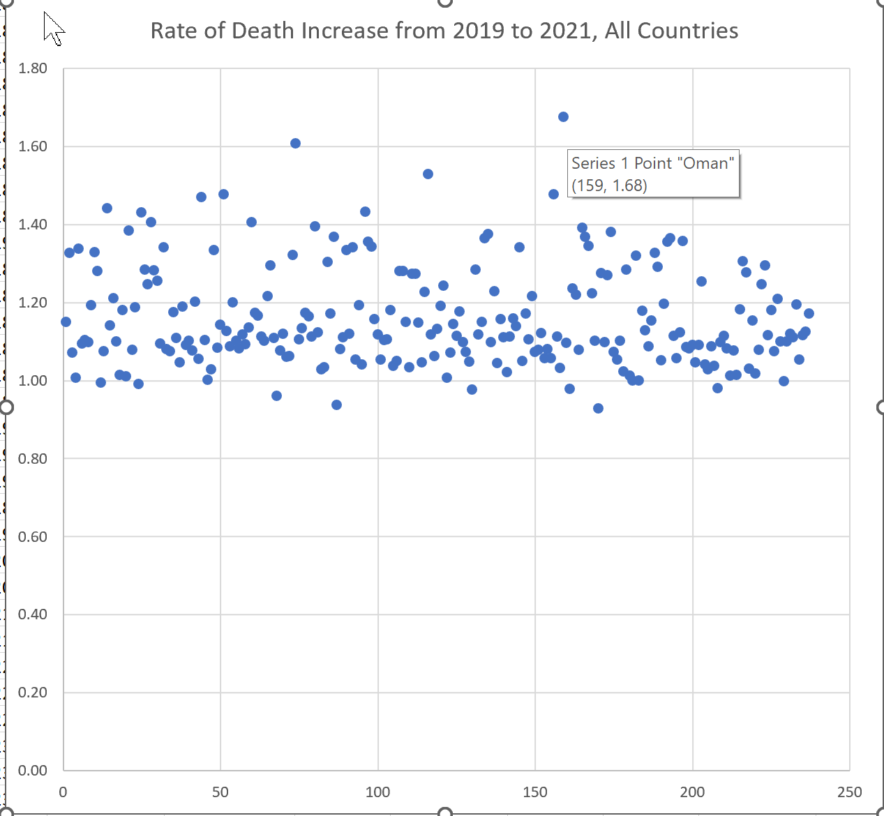
Increase in Death Rate
Exponential decrease in Birth Rate
and finally I threw in….More decrease in Birth Rate because so many of the “excess deaths” are in ages that should be fertile, men and women, and yes, I do know how to define that.
Source:
https://www.bloomberg.com/graphics/covid-vaccine-tracker-global-distribution/
https://ourworldindata.org/grapher/number-of-deaths-per-year
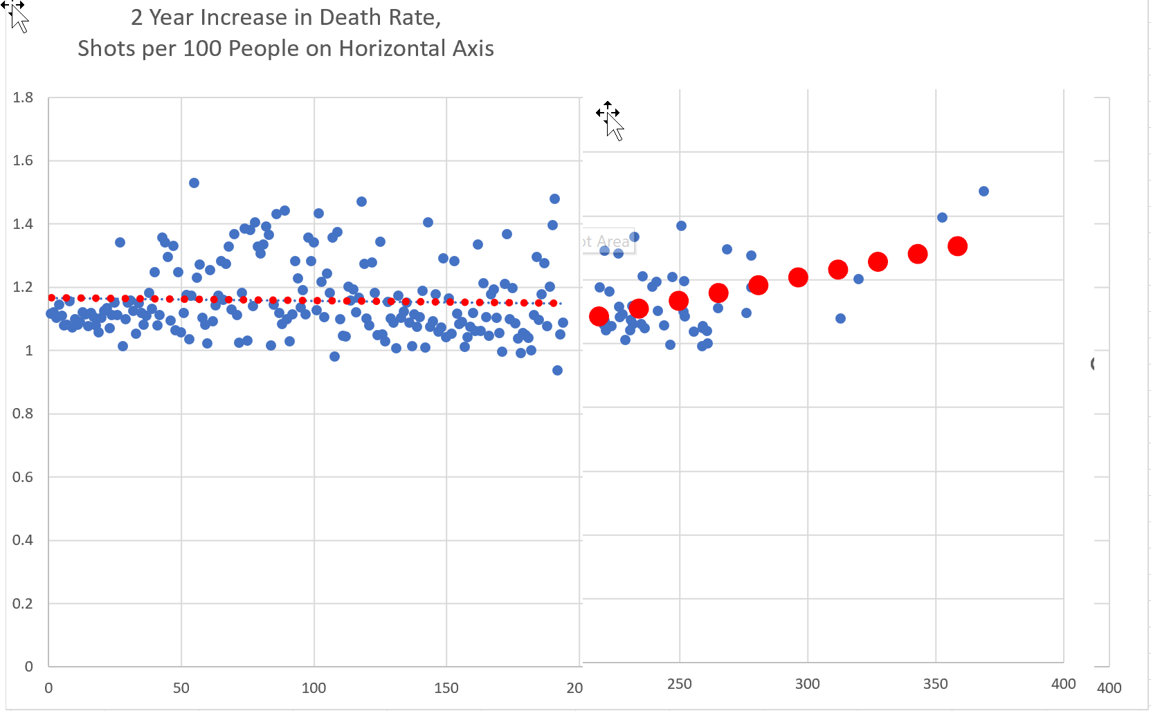
But when the death data was handed to me on a silver platter, it also occurred to me that we could compare current excess deaths to vaccination rates. Wouldn’t that be something that even a staunch blue piller would have a hard time rationalizing?
Scatter Chart
It took quite a bit of work to also get the vaccination status per country and then meld that into a single data set, as countries included were different at times, and different names or abbreviations. De Nada.
The chart below says it all. The horizontal axis is the number of shots injected per 100 people in that country. One would expect a much less death rate, the most robust countries being the best at getting jabs done, and also with better medical systems.
But that is not the case, the jabs barely show any decrease in death rate based on the trendline. But I did the chart in 2 pieces and melded them, to show the effect of more than 2 jabs. The more jabbed you are, the higher the chance that you are going to die.
Boom!
stock out